Work
About
Contact
Resume
Work
About
Contact
Resume
Work
Designer, illustrator and a meticulous travel planner living in California
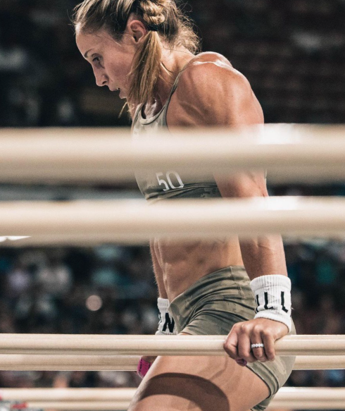
Crossfit Games
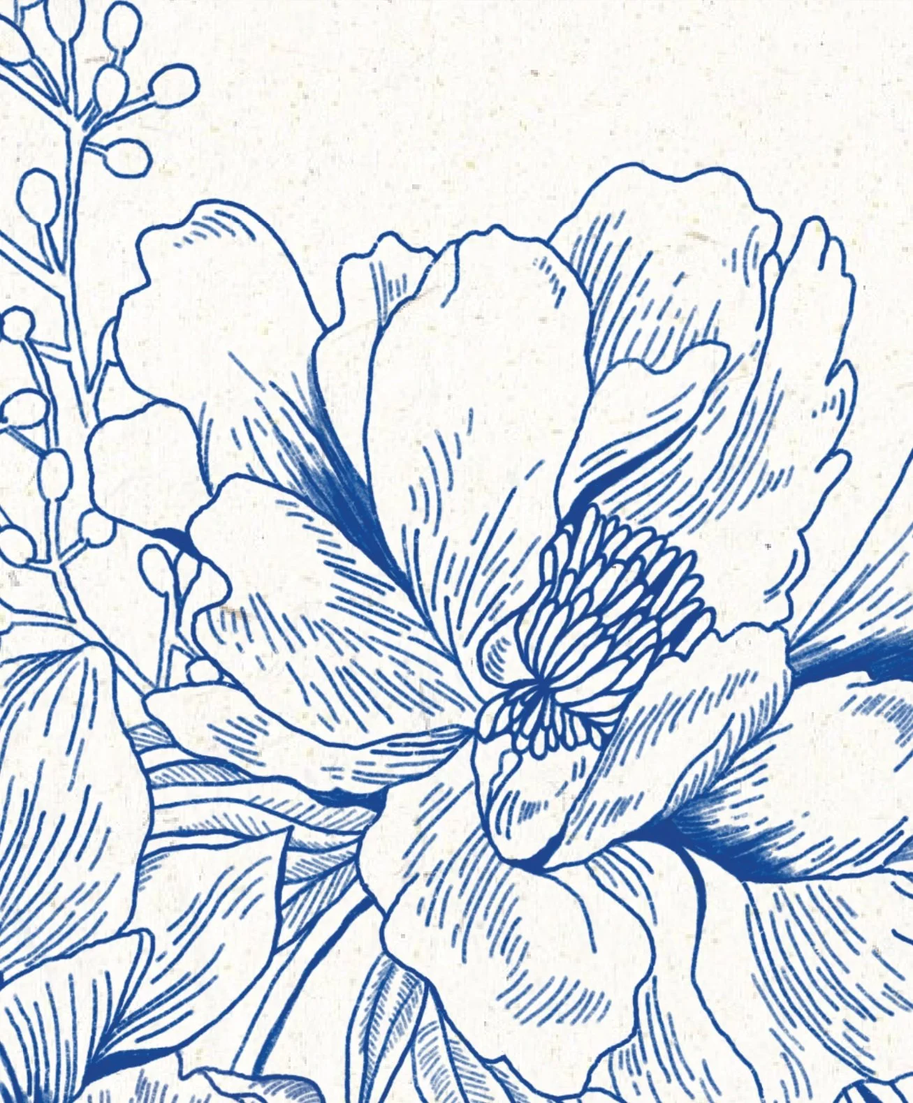
NOBULL Floral S/S 23
Budweiser Halloween
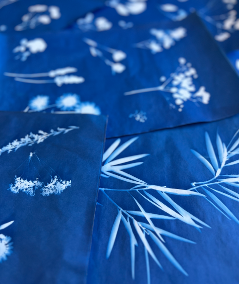
NOBULL Floral S/S 24
Floral Wedding Invite
The Glitch Collection
Always Wipes
Airia
Shutterfly
Traditional Indian Wedding
LPK Sustainability Report
Ink Your Love
Reebok Dance 2014